There are many ways to display data. In this post, we did an exercise which consists of identifying information sources of a report according to 8 indicator display types. Next time, we will probably do the reverse exercise.
Curves indicator display
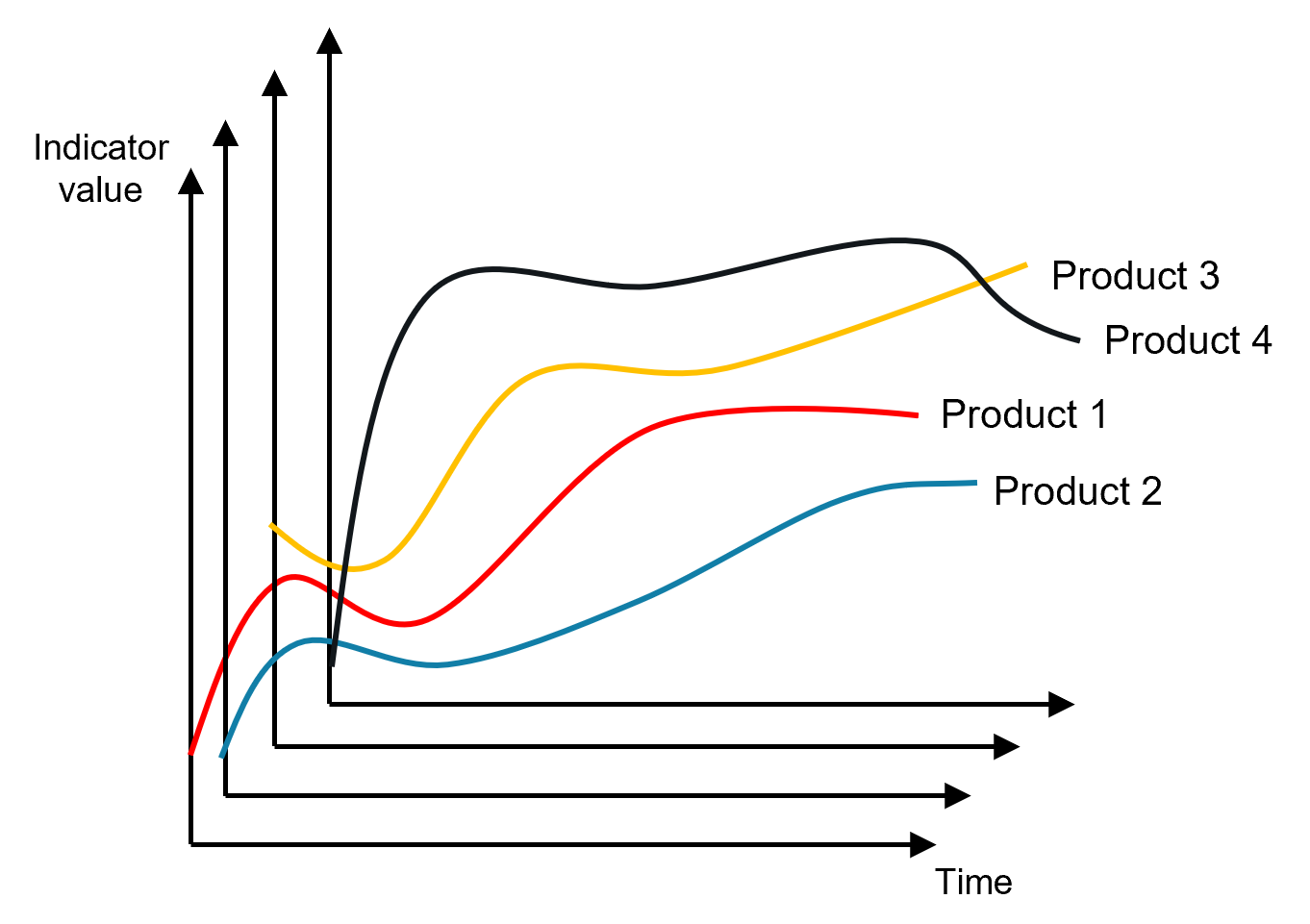
Curves allow to display the evolution of an indicator over time. That is the most common type of indicator. To design a curve, you will need:
- Business events source of the curve (e.g. sales)
- Calculation formula and the involved measures of the relevant business events (e.g. sales amount or visit-to-sale conversion rate)
- Periods you want to show (e.g. per day, per week)
- Dimensions for which the curve can be declined (for example, you can show sales for your whole company, by product, by country, or by product and country)
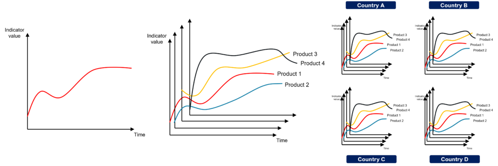
Diagram indicator display
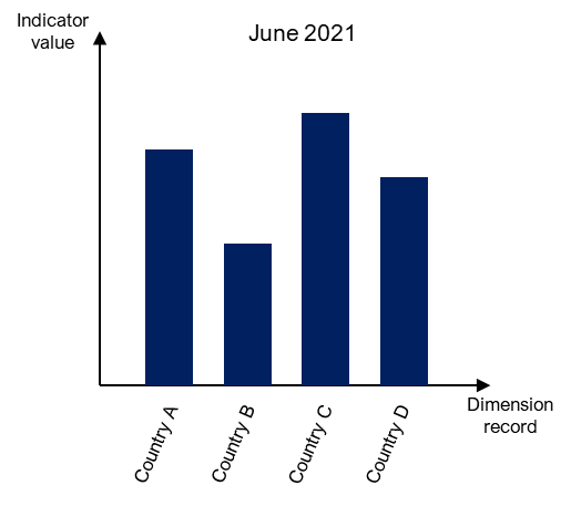
Generally, we use diagrams to compare one or more measures for a dimension with over a fixed period of time. For example: view June 2021 sales by country, view July sales by product. To design a diagram, you will need:
- Source business events (e.g. sales)
- Calculation formula and the involved measures of the relevant business events (e.g. sales amount or visit-to-sale conversion rate)
- Fixed period (e.g. a day, a week, a month)
- Dimension to measure (e.g. by country, by customer type, by product, …)
Histogram indicator display
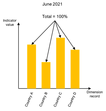
Unlike the diagram, the histogram displays proportions whose sum amounts to 100%. For example, it shows revenue dispatch by country or collaborator dispatch by salary. To design a histogram, you will need:
- Business events source of the histogram (e.g. sales)
- Proportion calculation formula and the involved measures of the relevant business events (e.g. sales amount or visit-to-sales conversion rate)
- Fixed period (e.g. a day, a week, a month)
- Dimension to measure (e.g. by country, by customer type, by product)
Pie chart indicator display
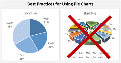
There is no difference between histograms and pie charts from a data point of view, the information needed is the same. End users like the pie chart but it has its limitation when it comes to clearly showing information. BI consultant consensus says it should not exceed 5 or 6 categories. Beyond this amount, you should use a histogram.
Boxes indicator display
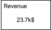
The simplest indicator representation, but it can still be complex to calculate. A box displays the information of a cube or a hypercube. For example, it can be the value of a curve, a bar in a diagram, or a pie piece.
Geographic indicator display
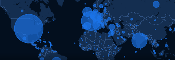
This indicator type needs the same information as a diagram or a pie except that one level of the geographic dimension is mandatory. Consequently, to design a geographic indicator, you should have:
- Business events source of the histogram, this business event must involve geographic information.
- Proportion calculation formula and the involved measures of the relevant business events (e.g. sales amount or visit-to-sale conversion rate)
- Fixed period (e.g. a day, a week, a month)
- Dimension to measure (e.g. by country, by customer type, by product)
Point Cloud
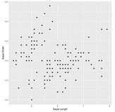
The point cloud is probably the data scientist preferred indicator display; it allows to show relations between two variables. What is remarkable about point cloud is the absence of the time dimension, which is not really “standard” in business intelligence tools. Consequently, to design a point cloud indicator, you should have:
- Business events source of the point cloud
- Fixed period (e.g. a day, a week, a month)
- Dimensions involved in source business event
Tree Map
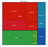
A good projection of a tree in two dimensions. It solves the same needs as a histogram and represents proportions. To design a tree map indicator, you should have:
- Business events source of the tree map (e.g. sales)
- Proportion calculation formula and the involved measures of the relevant business events (e.g. sales amount or visit-to-sale conversion rate)
- Fixed period (e.g. a day, a week, a month)
- Tree dimension to measure (e.g. by region, by country)
Others
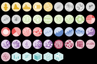
This list is just an overview. If you are interested in the different types of indicator display that exist, there is a very rich library in RStudio ggplot. You can find some ideas to represent your data just by looking at examples on this web-site.


One thought on “8 Indicators display types”